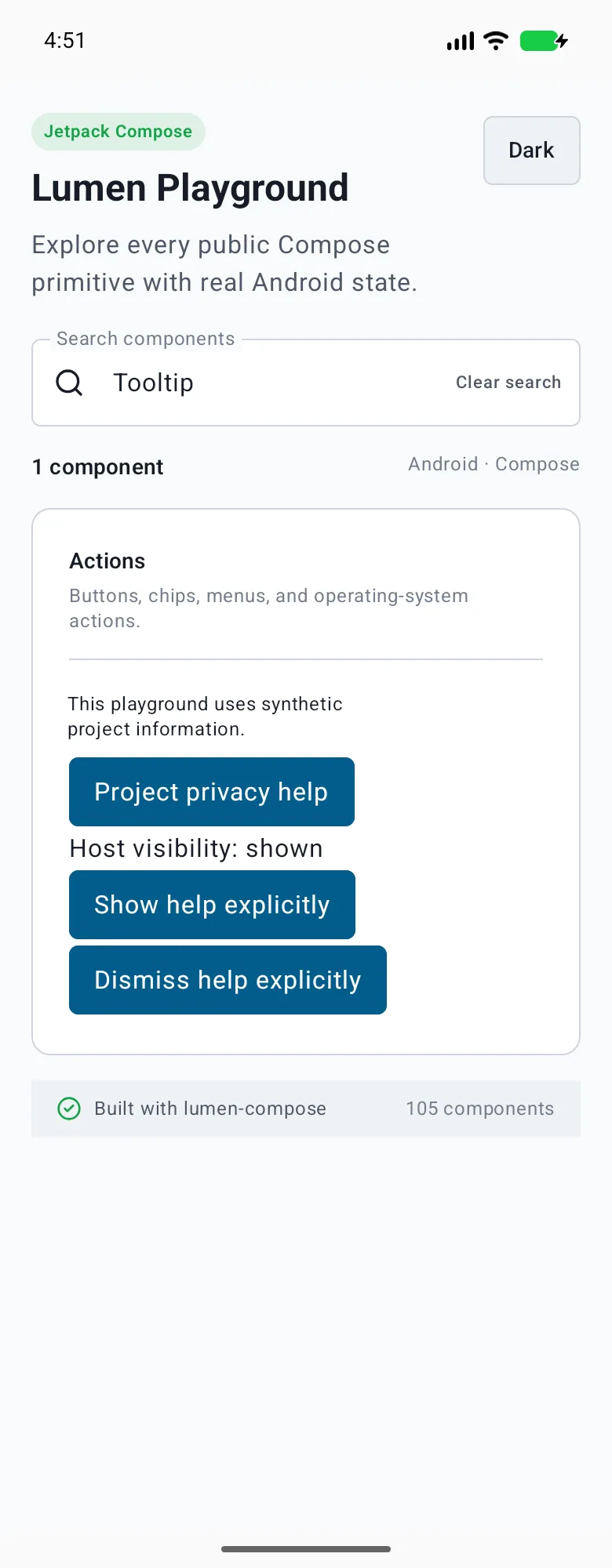
Use brief supplemental help. Essential instructions belong in visible content. Pass LumenTooltipState for explicit Compose show/dismiss controls; React Native uses visible/onVisibleChange and SwiftUI uses isPresented binding. Disabling dismisses help without removing the anchor.
The primary shared and platform-specific options exposed by LumenTooltip.
API
Values or type
Default
Description
text
String
Required
Provides non-empty translated contextual help.
modifier
Modifier
Modifier
Applies anchor-container layout.
state
LumenTooltipState
rememberLumenTooltipState()
Supports application-controlled visibility with Lumen state backed by Material.
enabled
Boolean
true
Enables help and dismisses it when disabled.
content
@Composable () -> Unit
Required
Provides an independently labeled native anchor.
Native behavior
Design and accessibility
When to use it
Use brief supplemental help. Essential instructions belong in visible content. Pass LumenTooltipState for explicit Compose show/dismiss controls; React Native uses visible/onVisibleChange and SwiftUI uses isPresented binding. Disabling dismisses help without removing the anchor.
Accessibility
Keeps the anchor independently named and delegates long-press, pointer, and popup dismissal to Material.