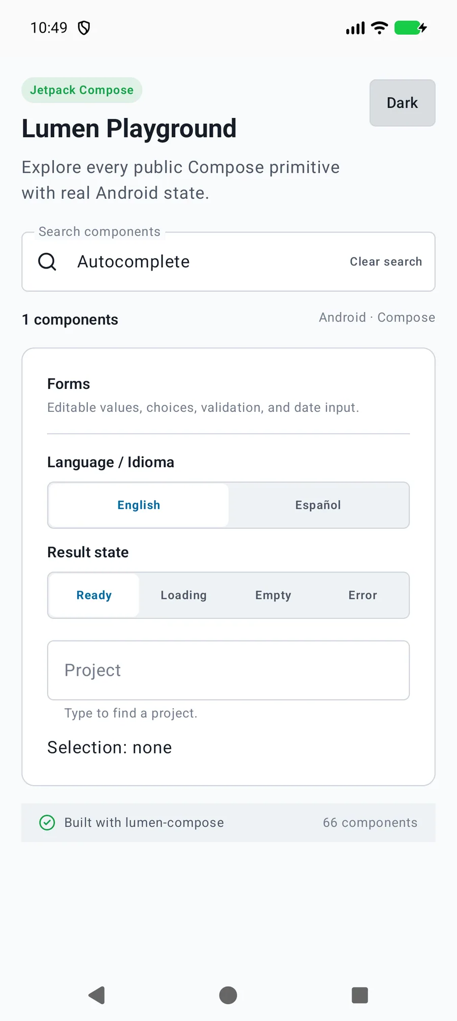
The application supplies filtered results with unique non-null values, owns request cancellation, and clears stale selection after query edits. React Native and Compose selection emit the option label before the selected value; SwiftUI updates bindings directly.
The primary shared and platform-specific options exposed by LumenAutocomplete.
API
Values or type
Default
Description
label
String
Required
Names the editable field.
query / onQueryChange
String / (String) -> Unit
Required
Controls the editable search text.
options
List<LumenAutocompleteOption<T>>
Required
Supplies current results with value, label, optional description, and enabled state.
value / onValueChange
T? / (T) -> Unit
null / Required
Controls selected result identity; option values must be unique and non-null.
modifier
Modifier
Modifier
Applies layout and semantics to the dropdown container.
description / errorMessage
String?
null
Shows supporting text or field validation.
loading
Boolean
false
Shows loading feedback instead of stale results.
resultsErrorMessage / onRetry
String? / (() -> Unit)?
null
Shows a result failure and optional application-owned retry.
loadingLabel / emptyLabel / retryLabel
String
Loading results / No results / Retry
Localizes result status and recovery.
enabled / readOnly
Boolean
true / false
Controls query edits and dismisses open results when editing becomes unavailable.
Native behavior
Design and accessibility
When to use it
The application supplies filtered results with unique non-null values, owns request cancellation, and clears stale selection after query edits. React Native and Compose selection emit the option label before the selected value; SwiftUI updates bindings directly.
Accessibility
Preserves native editable dropdown focus, selected and disabled option semantics, and announced loading, empty, and recovery states.