When to use it
Use a remembered scrolling behavior and attach its nested-scroll connection above native scroll content. The application owns routing and Scaffold content padding.
Present native screen titles, navigation, and scrolling app bars.
Native example
Use a remembered scrolling behavior and attach its nested-scroll connection above native scroll content. The application owns routing and Scaffold content padding.
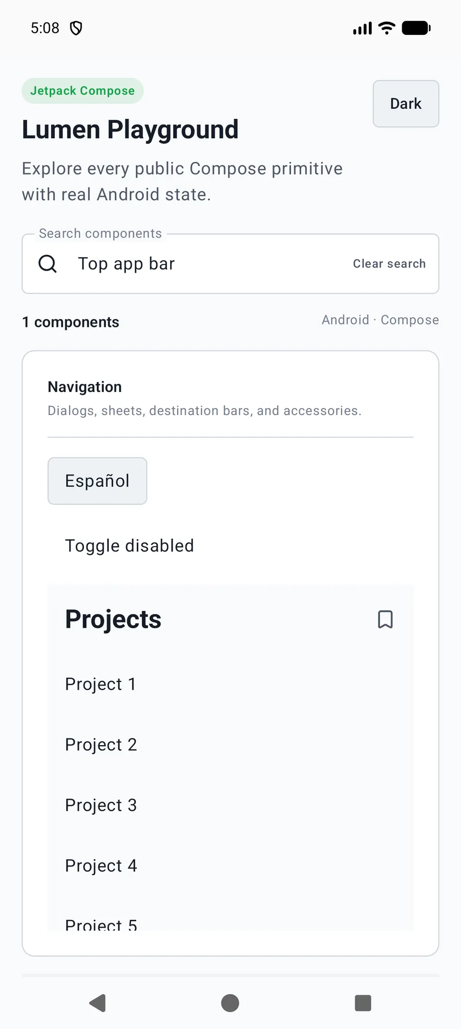
val behavior = rememberLumenTopAppBarScrollBehavior(LumenTopAppBarScrollMode.EnterAlways)
// Attach Modifier.nestedScroll(behavior.nestedScrollConnection) to the screen container.
LumenTopAppBar("Projects", scrollBehavior = behavior,
    navigationIcon = { LumenIconButton(LumenIconName.ArrowLeft, "Back", onClick = ::goBack) })
Reference
The primary shared and platform-specific options exposed by LumenTopAppBar.
| API | Values or type | Default | Description |
|---|---|---|---|
| title | String | Required | Provides the visible screen heading. |
| size | LumenTopAppBarSize | Small | Selects Small, Medium, or Large native geometry. |
| scrollBehavior | LumenTopAppBarScrollBehavior? | null | Coordinates Pinned, EnterAlways, or ExitUntilCollapsed behavior. |
| navigationIcon / actions | @Composable slots | Empty | Provides independently named application actions. |
| modifier | Modifier | Modifier | Applies bar layout. |
Native behavior
Use a remembered scrolling behavior and attach its nested-scroll connection above native scroll content. The application owns routing and Scaffold content padding.
Exposes a screen heading and preserves native navigation, action, and window-inset semantics.