When to use it
Bounds must be finite, increasing, and have a finite span. Nonfinite values fall back to bounds; reversed endpoints reorder for display without changing host state. Keep exact financial arithmetic in the application.
Choose bounded numeric intervals with independently adjustable native endpoints.
Apple availability
Import LumenUI in the target that uses this component. iPad support follows the iOS package baseline and uses native iPad layout behavior.
Native example
Bounds must be finite, increasing, and have a finite span. Nonfinite values fall back to bounds; reversed endpoints reorder for display without changing host state. Keep exact financial arithmetic in the application.
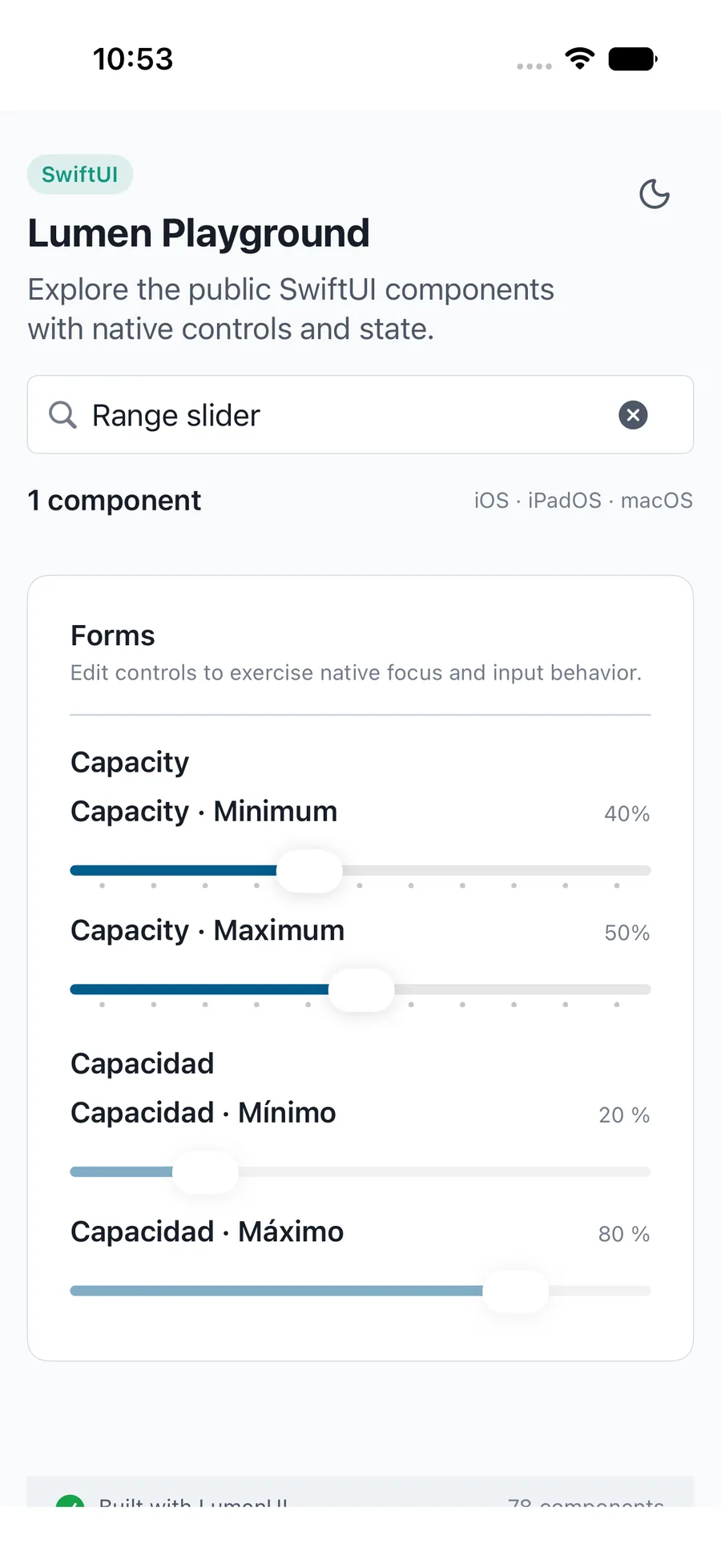
LumenRangeSlider("Capacity", value: $capacity, in: 0...100, step: 10,
    formatValue: { "\(Int($0))%" })
Reference
The primary shared and platform-specific options exposed by LumenRangeSlider.
| API | Values or type | Default | Description |
|---|---|---|---|
| label / value | LocalizedStringKey / Binding<ClosedRange<Double>> | Required | Names and controls the numeric interval. |
| in | ClosedRange<Double> | 0...100 | Provides valid inclusive bounds. |
| step | Double? | nil | Compose counts intermediate stops; Swift and React Native use positive increments. |
| startLabel / endLabel / formatValue | LocalizedStringKey / LocalizedStringKey / (Double) -> String | Minimum / Maximum / numeric text | Localizes both endpoint names and values. |
| disabled / readOnly | Bool | Enabled / editable | Blocks adjustment while retaining values. |
| — | — | — | Reports the end of native adjustment. |
| — | — | None | Applies control layout. |
Native behavior
Bounds must be finite, increasing, and have a finite span. Nonfinite values fall back to bounds; reversed endpoints reorder for display without changing host state. Keep exact financial arithmetic in the application.
Exposes separately named lower and upper native thumbs with formatted spoken values and keyboard adjustment.
Shared component