When to use it
Use for supplemental editing or detail that should not replace the current screen. Keep form state and dismissal decisions application-owned.
Present supplemental application content in a controlled native sheet.
Apple availability
Import LumenUI in the target that uses this component. iPad support follows the iOS package baseline and uses native iPad layout behavior.
Native example
Use for supplemental editing or detail that should not replace the current screen. Keep form state and dismissal decisions application-owned.
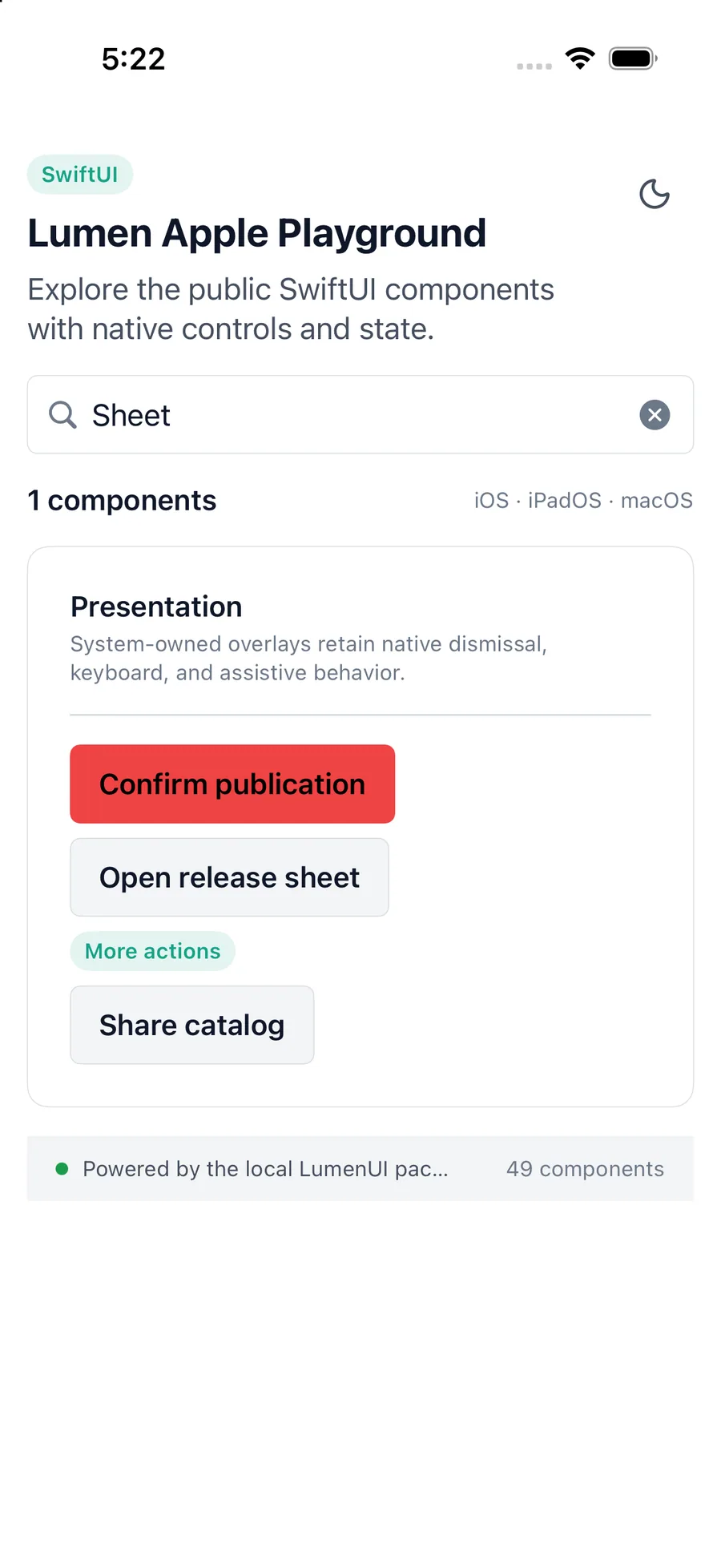
content.lumenSheet(
    isPresented: $showEditor,
    title: "Edit report"
) {
    ReportEditor()
}
Reference
The primary shared and platform-specific options exposed by lumenSheet.
| API | Values or type | Default | Description |
|---|---|---|---|
| dismissible | Boolean | true | Allows platform gestures, back actions, and backdrop dismissal. Set false while application work requires the sheet to remain open. |
| scrollable | Boolean | true | Scrolls content with reachable actions. Short windows and accessibility text sizes may scroll the complete sheet; set false for application-owned lazy or virtualized containers. |
| — | RefObject<HostInstance | null> | undefined | Optionally focuses an accessible application-owned control after presentation and restores its trigger after closing. |
| isPresented | Binding<Bool> | Required | Controls native sheet presentation. |
| title / description | Native localized text | nil / undefined | Provides optional heading context. |
| onDismiss | () -> Void | Required | Returns presentation ownership to the application. |
| content / actions | Native view slots | Actions optional | Composes application-owned content and actions. |
Native behavior
Use for supplemental editing or detail that should not replace the current screen. Keep form state and dismissal decisions application-owned.
The native modal presentation contains focus while preserving the semantics and reading order of application-owned content.
Shared component